 Find a store






 All Bathware
 Circle
 Fan
 Herringbone
 Rectangular
 Square
 Hexagon
 Rhombus


 1 Minute Read
 Nov 02


Colour trends in tiles: the NZ palette guide for 2027
Colour in tile is one of the most consequential decisions a homeowner makes and one of the most under-researched. It's easy to choose a tile you love in a showroom and harder to know whether it's a choice you'll still love in five years. That's where trend intelligence earns its keep: not as a reason to follow the crowd, but as a framework for understanding which directions have longevity and which are already on the way out.
At Tile Warehouse, our buying team attends Cersaie, the world's largest tile fair, held annually in Bologna, Italy, where the tile industry's most significant brands showcase product a full 12 to 18 months ahead of market arrival. Combined with our 35+ years of NZ market experience and our observation of what NZ homeowners are actually choosing across 35+ stores nationwide, we have a genuinely informed view of where tile colour is heading.
This is our forward-looking palette guide for 2027. Not what was trending last season. What's coming.
The context: why colour in tile is shifting right now
The 2010s were cool. Literally: the dominant tile palette of that decade was grey. Cool greys, charcoal greys, grey-tinted whites. The interiors that defined the era were clean, minimal, and colour-cautious to the point of clinical.
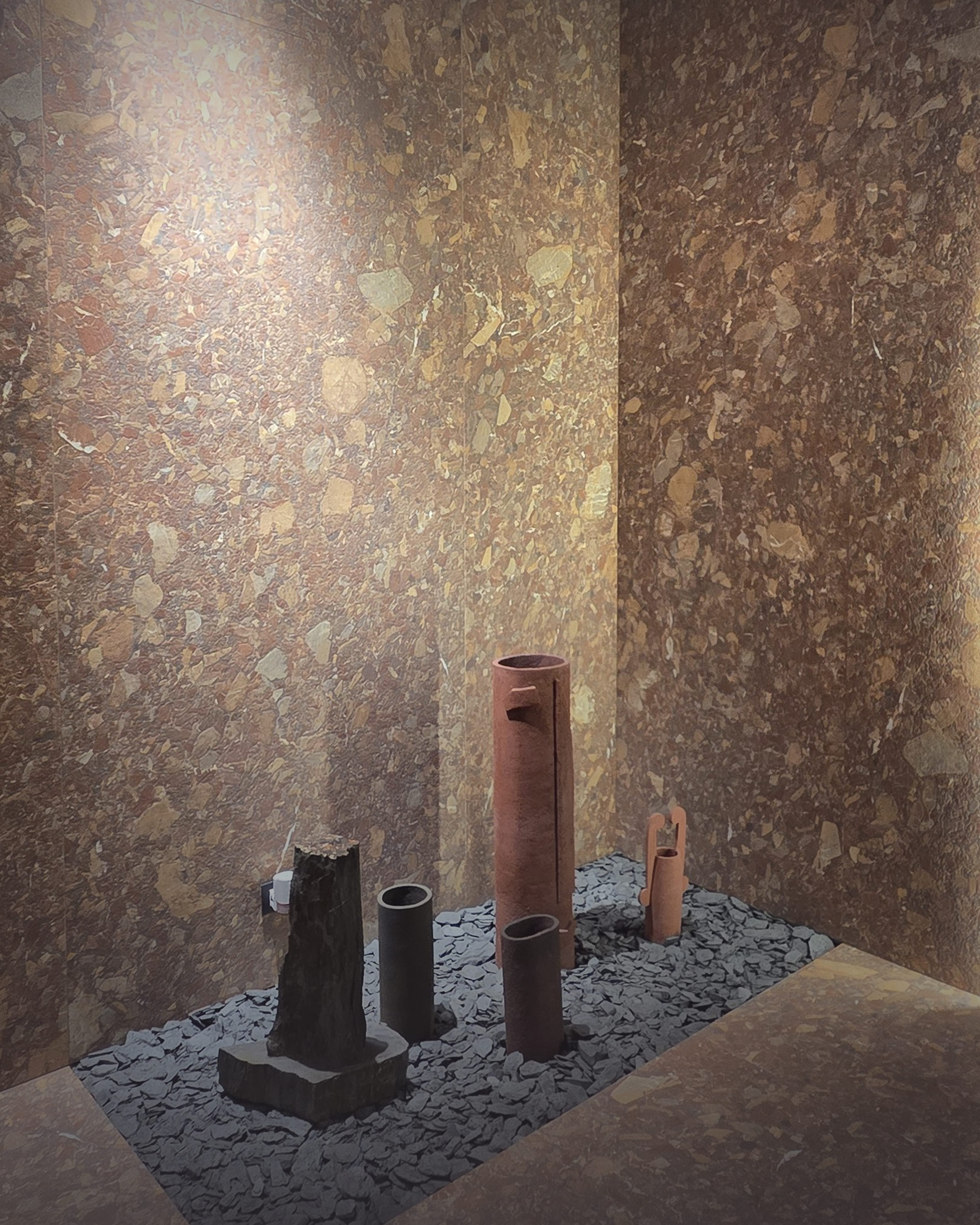
The countermovement is well established now, and it's accelerating. NZ homeowners are moving toward warmth, depth, and natural authenticity, with surfaces that feel as though they came from the earth rather than a factory. This is playing out in colour through a dual story: warm, grounded neutrals as the dominant palette foundation, with confident, saturated accent colours used strategically to add personality without overwhelming the space.
Tile Warehouse's own 2027 trend reporting confirms what we're seeing from Italy: soft natural neutrals are replacing cooler tones, rich earthy shades like terracotta and sand are gaining momentum, and strategic colour (botanical greens, deep teals, warm blues) is being used with intention. Simultaneously, natural stone and marble looks are strengthening their position as the most enduringly relevant tile category across every room type.
Pantone's 2026 Colour of the Year, Cloud Dancer PANTONE 11-4201, described as "a lofty white that serves as a symbol of calming influence", captures one dimension of this shift. But it's one colour in a much richer picture. Here's the full palette story for 2027.
Palette 1: Warm whites and lofty neutrals
The direction: Warm, off-white, and creamy tones are replacing the cool, blue-tinted whites that dominated NZ interiors for a decade. These are whites that feel like they've absorbed sunlight rather than reflected fluorescent light: ivory, chalk, linen, and the very pale beige of bleached stone.
Why it has longevity: Warm whites are fundamentally easy to live with. They work across every architectural style, every room type, and every finish from matt to polished. They're also the natural backdrop for richer accent colours, which means they function as a palette foundation that grows with the home rather than dating it.
In New Zealand homes right now: The shift is already visible in what our team is selling. Ivory and off-white stone-look tiles in large format are consistently our most requested colourway. Homeowners who previously chose mid-grey are now arriving in store looking for something warmer.
Our ranges
The Travertino range in Bianco and Ivory captures this palette perfectly, with vein-cut travertine-look porcelain that has the warm movement of natural stone. The Karnis Ivory brings a reactive glaze sophistication to the same warm white territory, available across floor and wall formats. For a simpler, more affordable expression.
Browse: Shop ivory and off-white tiles →
Palette 2: Earthy warmth: terracotta, sand, and clay
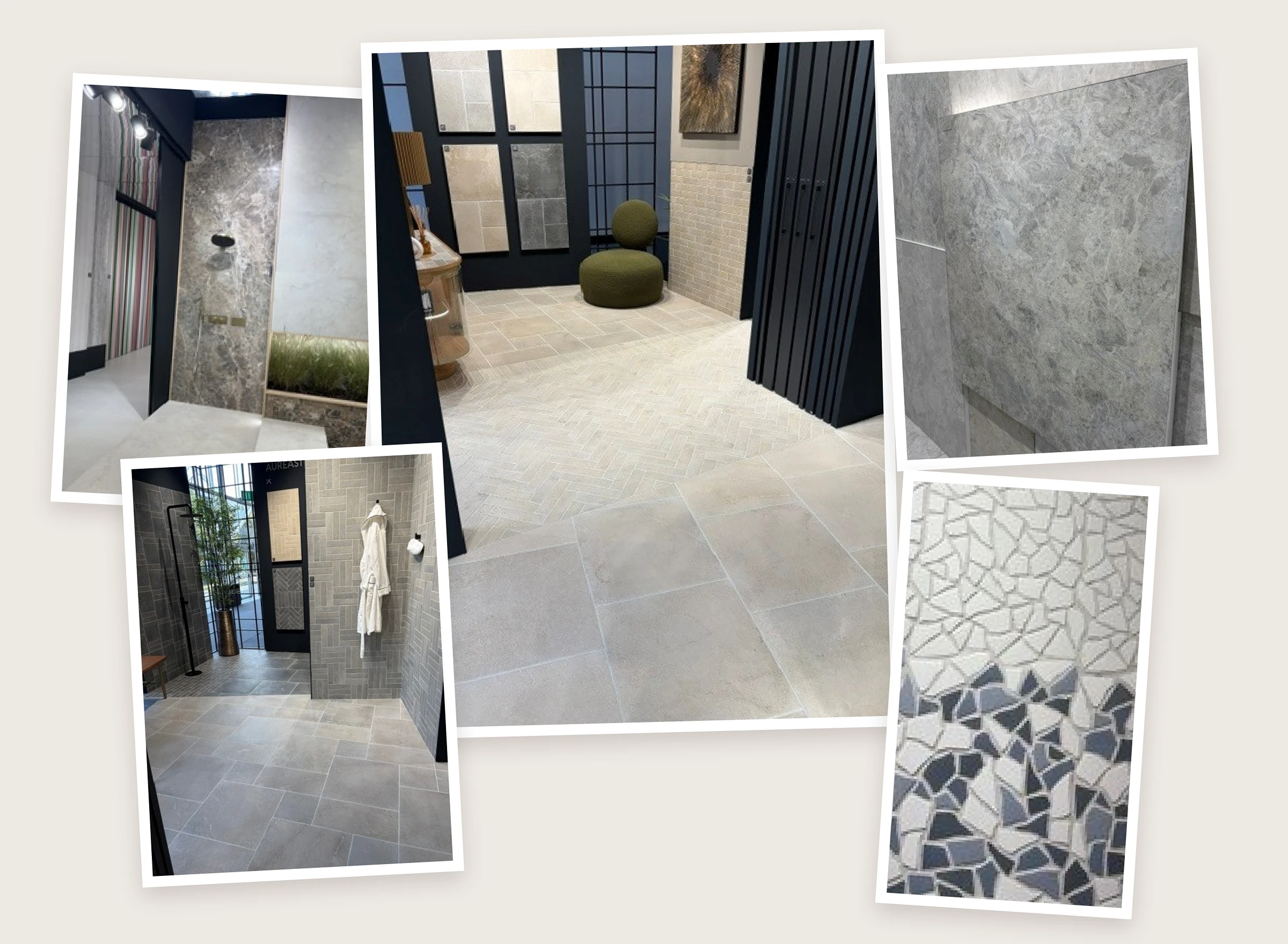
The direction: Rich, warm earth tones like terracotta, clay, burnt orange and raw sand are emerging strongly around the world. These are colours connected to the natural, earthy design movement: surfaces that feel grounded, organic, and rooted in the natural landscape. They bring Mediterranean and Moroccan warmth to NZ interiors that previously stayed safely neutral.
Why it has longevity: Earth tones are psychologically grounding and visually warm. They make rooms feel inhabited and comfortable in a way that cooler colours don't. They also function brilliantly as accent colours within a warm neutral scheme, adding depth without overwhelming the space.
The trend data: Tile Warehouse's own 2026 kitchen tile trend reporting notes that "soft shades inspired by natural materials like rich browns, terracotta and sand are replacing cooler tones, bringing warmth and encouraging an organic feel." This is playing out across both kitchens and bathrooms, and we expect it to amplify through 2027.
The Tile Warehouse ranges
The terracotta and orange colour filter surfaces a curated selection across floor, wall, and decorator formats. Zellige ft. Bordeaux, a deep burgundy-red in a hand-crafted Moroccan gloss, captures the richest, most saturated end of this palette. For a softer, more architectural take, Piero Sand In/Out Matt 600x600 brings the pale golden end of the earth tone spectrum into indoor-outdoor applications.
Palette 3: Botanical greens
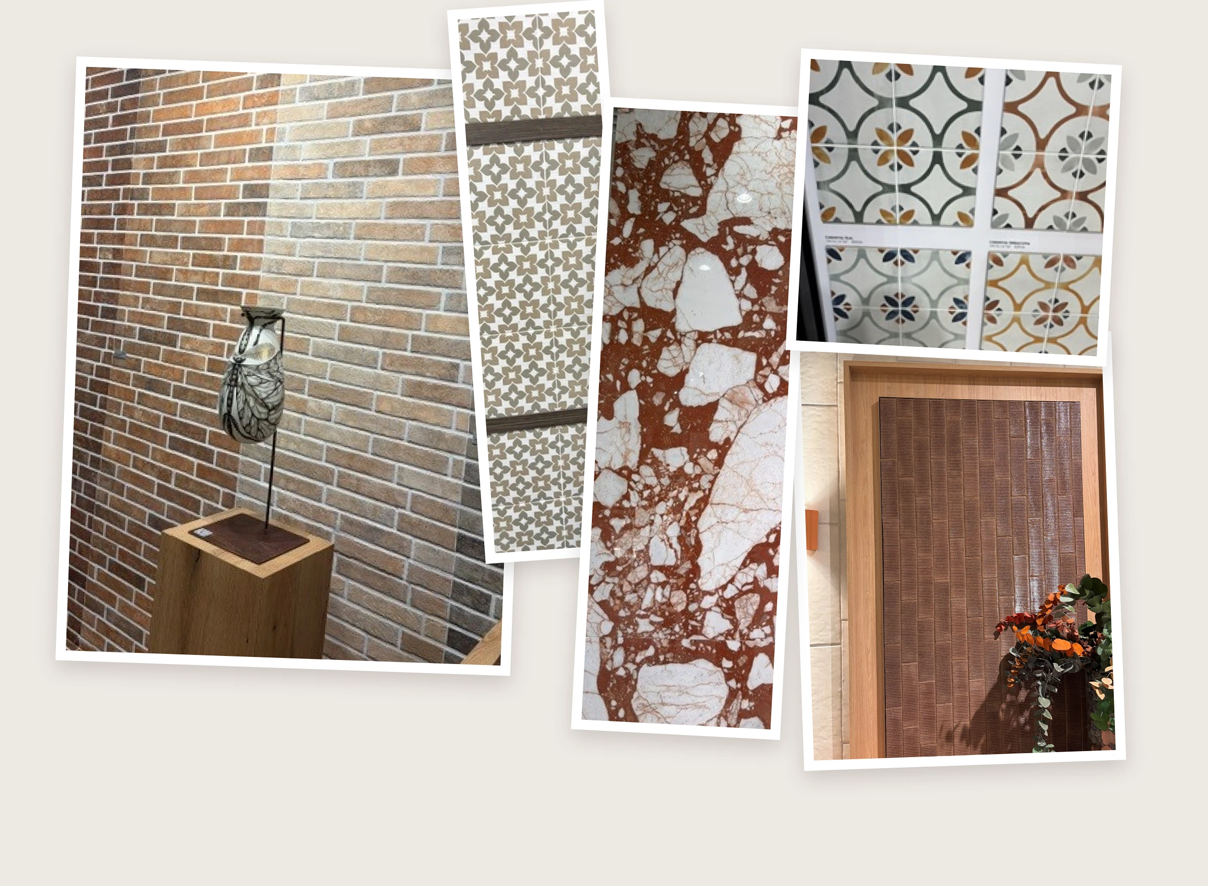
The direction: Green has been building momentum in interiors for several years and shows no sign of peaking. It's consistently our most searched colour online. From the deep forest tones that dominated early in the decade to the more varied, nuanced green palette emerging now (sage, moss, muted eucalyptus, and deeper botanical tones), green tile is firmly established as the colour accent of choice for homeowners who want personality without pattern.
Why it has longevity: Green is inherently connected to nature, triggering the same biophilic response as indoor plants and natural light. In a tile context, green works across bathroom feature walls, kitchen splashbacks, and outdoor spaces with equal confidence. It pairs naturally with warm neutrals, timber, and brushed metal finishes.
What our team is seeing: Tile Warehouse's own content notes that green in all its forms "is inherently tranquil and connected to nature" and that "choosing tiles from this colour palette will have longevity." Across our stores, green is consistently one of the most-requested accent colours for bathroom feature walls and kitchen splashbacks.
The Tile Warehouse ranges
The Bali ft. Green range takes botanical green into wet area applications with its 47x47mm matt chip format. For interior feature walls and splashbacks, our green colour filter covers everything from muted sage mosaics to richer, more saturated gloss options.
Browse: Shop green tiles →
Palette 4: Deep accent tones: teal and blue
The direction: While the dominant palette story for 2027 is about warmth and earth, there's a parallel movement toward deep, rich accent colours used with confidence in specific, contained applications. Deep teal, ocean blue, and rich charcoal are all gaining ground, particularly in pool applications, bathroom feature walls, and kitchen splashbacks where a single surface is designated to carry the room's colour identity.
Why it has longevity: Deep accent tones work precisely because they're used sparingly or in a natural setting. Whether it's one deep teal feature wall or a pool waterline, it's considered and plays into the feeling of water in nature. The contained application is what makes the colour feel considered rather than bold, and it's a technique that transcends trend cycles.
The Tile Warehouse ranges
Miyako Blue Moon Gloss 50x150 captures the luminous, water-like quality at the most aspirational end of this palette, and is equally extraordinary as a pool waterline tile or a bathroom feature wall. The Otway Dark Blue Gloss 60x240 delivers deep ocean blue in an elongated brick format that works beautifully as a kitchen splashback.
Browse: Shop blue tiles →
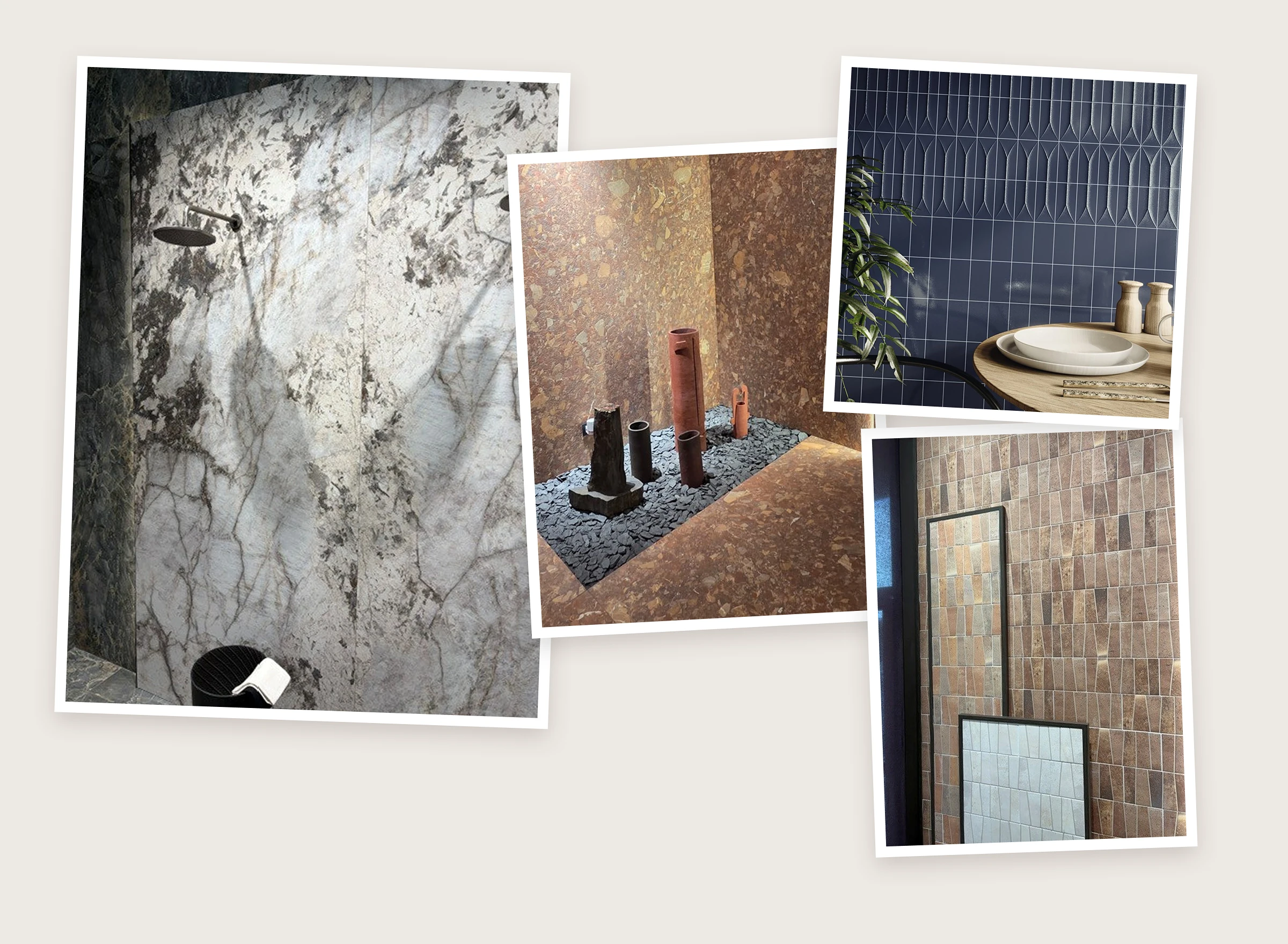
Palette 5: Natural stone and marble, the enduring foundation
The direction: Natural stone and marble, in both genuine and porcelain-replica form, are not a trend. They are the baseline against which every other tile colour is measured, and their position in NZ interiors for 2027 is more secure than ever. The movement has driven a significant resurgence of travertine, limestone, and marble looks, and Tile Warehouse's own stone expertise, built over more than 35 years, positions us uniquely to help NZ homeowners navigate this category.
Why it endures: Natural stone and marble look genuinely different from every other tile category because they are genuinely different. No two slabs are exactly the same. The variation, the movement, the way light changes across a honed versus polished surface: these are qualities that cannot be manufactured, only found. Porcelain replicas have reached remarkable quality levels and offer excellent value for money; the natural stone originals remain the premium choice for homeowners who want the real thing.
The Tile Warehouse ranges
The Classic Carrara Marble Mosaics range covers real Carrara marble in hexagon, arabesque, diamond, and fan shapes that are genuinely unique and irreplaceable. For large-format porcelain marble and stone looks, Karnis Silver (reactive glaze, warm silver-grey stone movement) and the broader marble-look range offer the visual richness of natural stone with the practical advantages of porcelain.

How to use this palette guide practically
Trend intelligence is only useful if it helps you make better decisions. Here's how to apply this palette guide to your own renovation:
Start with your foundation, not your feature. The dominant tile in any room, typically the floor and the main wall, should come from the warm white, earthy neutral, or stone and marble palette families. These are your 70–80% colour commitment. Get this right and the feature colour almost selects itself.
Choose one accent colour and commit to it. The botanical greens, deep teals, and rich earth tones in this guide work best when used on a single surface: a splashback, a feature wall, a pool waterline. The same accent colour spread across multiple surfaces in a room stops being an accent and becomes a colour scheme.
Order samples and look at them in your light. Every colour reads differently in different light conditions. A warm ivory that looks perfect in our showroom may read slightly cooler or warmer in your specific room orientation. The sample step is essential before any large colour commitment.
Trust your eye over the trend. This guide reflects where NZ and global tile design is heading, but the best tile choices are always the ones that feel right for the specific home, the specific homeowner, and the specific life being lived in that space. Use trend intelligence as a confidence check, not a rulebook.
Ready to find your palette?
Browse the full range by colour at Tile Warehouse and shop by colour here. Visit your nearest store, with 35+ locations nationwide, to see these palettes in person, order samples, and talk to our team about what's right for your specific project.
Our team across all stores are trained in colour and material specification and can guide you through the full palette decision from foundation tile to feature accent, floor to wall, inside to outside.
Frequently asked questions
What tile colours are trending in NZ for 2026/2027?
The dominant palette story for 2026/2027 in NZ is warm whites and off-whites (replacing cool greys), earthy tones (terracotta, sand, clay), and botanical greens as accent colours. Stone and marble looks remain the most enduringly relevant tile category across all room types.
Are grey tiles still popular in NZ in 2026?
Warm greys remain popular, but cool, blue-tinted greys are declining in NZ interiors. The palette shift is toward warmth: ivory, beige, and soft stone looks are replacing the cooler mid-greys that dominated the previous decade.
What colour tiles make a bathroom look more luxurious?
Warm stone and travertine looks, particularly in large format, consistently deliver the most luxurious bathroom result. Ivory and off-white tones in a continuous floor-to-wall application, paired with brushed brass or matte black hardware, is the combination most aligned to the quiet luxury aesthetic defining NZ bathrooms in 2026.
Are green tiles a good choice for a NZ bathroom?
Yes, green tile is one of the most design-forward choices for NZ bathroom feature walls and splashbacks in 2026/27. It works particularly well in a contained application (one feature wall, a shower recess) against a warm neutral backdrop. Muted botanical and sage tones have the most longevity; bright lime greens are more trend-dependent.
What tile colours will be popular in 2027?
Based on Tile Warehouse's buying team observations at Cersaie and global trend data, the 2027 palette continues the warmth story of 2026 with increased richness: deeper earthy tones, richer botanical greens, and greater confidence in using saturated accent colours. Natural stone and marble looks continue to consolidate as the premium category. The cool grey chapter of NZ interiors is closing.

 Save and collect tiles

