 Find a store






 All Bathware
 Circle
 Fan
 Herringbone
 Rectangular
 Square
 Hexagon
 Rhombus


 1 Minute Read
 Nov 04


Grout colour guide: the design decision you need to get right
Look at any tiled room and you're not just seeing the tile. You're seeing the tile and the grout together. The grout is the grid every tile is read through.
Change the grout and you change the whole character of the surface, even when the tile stays exactly the same. A soft white marble-look porcelain with a pale grey grout reads calm and seamless. The same tile with a charcoal grout reads graphic and modern. Both can be beautiful. Both can also be exactly wrong for the room.
The trouble is, most people choose grout at the very end, as a final thing to consider, and the sample is a tiny chip held against one tile under showroom lights. This guide gives you a better way to decide.
The three grout approaches and when to use each
1. Tonal grout, the most versatile choice
A tonal grout sits within two or three shades of the tile. Not identical, but close enough that the grout lines don't compete with the surface.
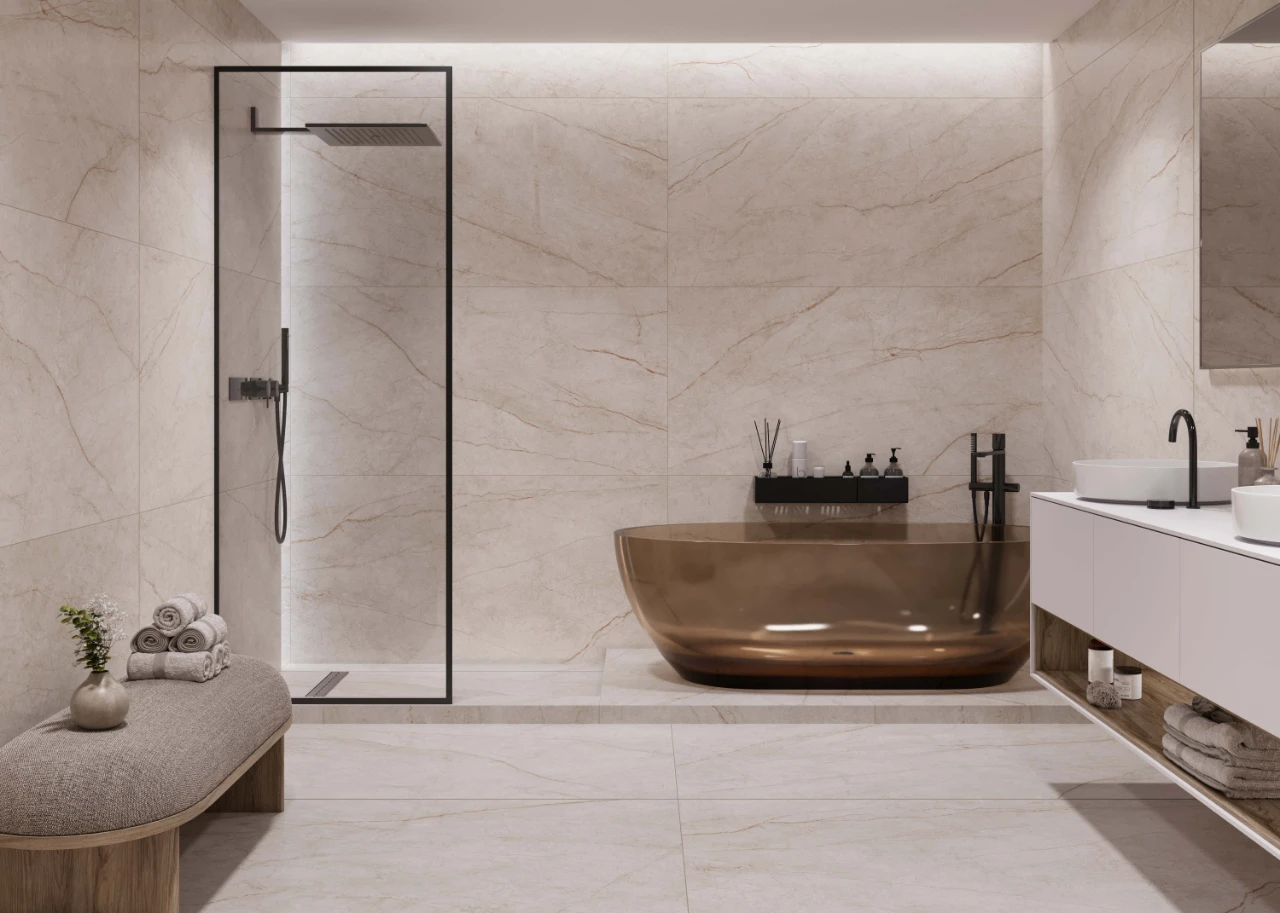
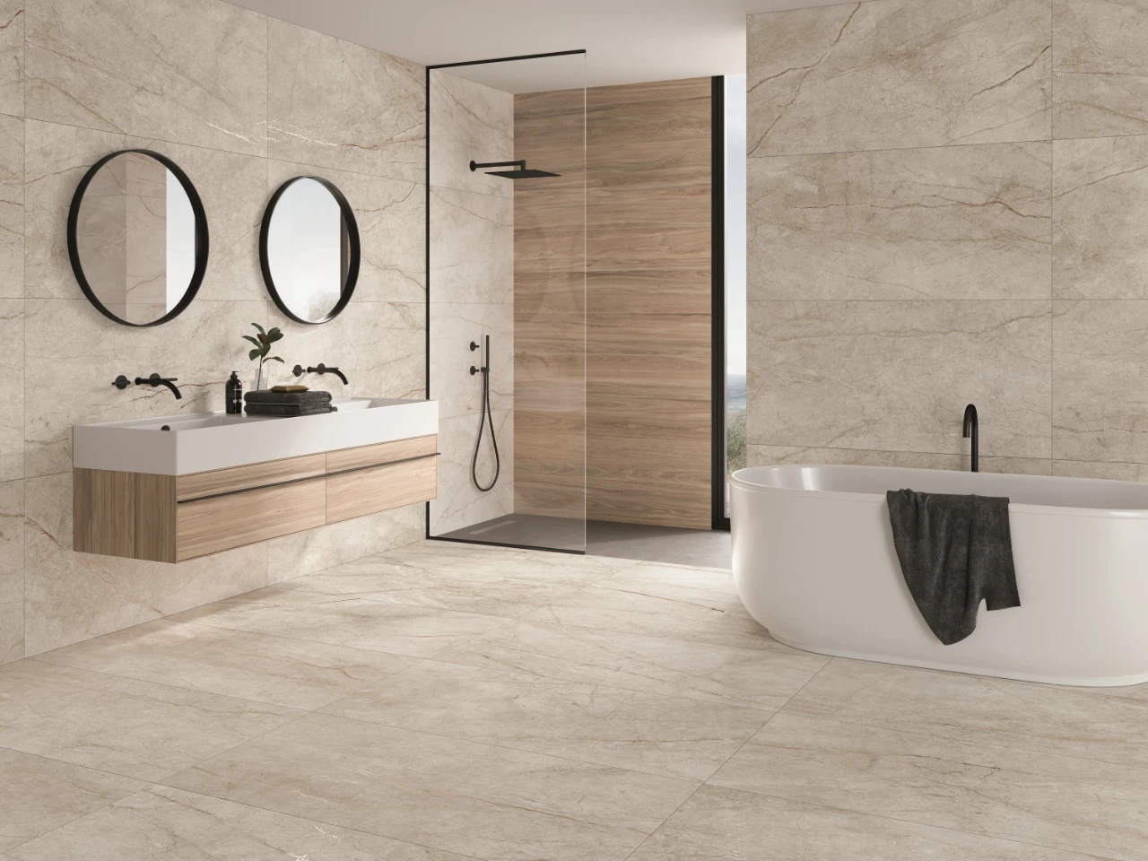
For most bathrooms and living spaces, this is the choice you'll be happiest with for years. It lets the tile's own colour, veining and movement do the talking. With large format porcelain in particular, a tonal grout is almost always right: fewer grout lines plus a close tone gives you that calm, spa-like finish large tiles are chosen for.
When to use it: Marble-look and stone-look porcelain, large format floors and walls, and anywhere calm and continuity are the goal.
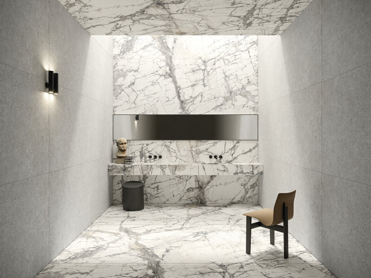
Pairing example: Rainforest White with a soft white or very pale grey grout. Inspired by silver roots marble, its fine veining carries across the floor and the grout lines all but disappear.
2. Contrasting grout, a deliberate design statement
A contrasting grout uses the difference between tile and grout on purpose. It sharpens the grid, makes the tile shape more graphic and adds a layer of pattern a tonal grout avoids.
Done well, it's a confident design move. Done without intention, it looks like a mistake.
It works best where the shape of the tile is part of the design: decorators and mosaics, smaller formats, splashbacks and walls laid in a clear pattern.
When to use it: Decorators and mosaics, small format wall tiles, splashbacks, and any surface where you want the grid to read as part of the look.
One rule: If you go contrasting, commit to it. A grout that's nearly but not quite the tile colour reads as an accident, not a decision. Commit to the contrast or commit to the tone.
3. White grout, the most misused option
White grout is the default for many NZ homeowners, and it's often the wrong call.
With white tiles it works beautifully, disappearing into the surface. With warm or coloured tiles it creates tension: the cool white reads against the tile, breaks up the surface and pulls the grout lines forward.
White grout also shows marks faster in busy areas like shower floors and kitchen splashbacks, and once it discolours it's hard work to bring back.
When white grout works: White and near-white tiles on walls and splashbacks that are sealed and regularly cleaned. Decorators where a fine white line helps each shape read.
When to avoid it: Warm and coloured tiles (sand, ivory, terracotta, green), floors in busy kitchens and bathrooms, and large format tiles where you want one continuous surface.
Colour is the point: grout for coloured and patterned tiles
Colour-led tiles are where grout makes or breaks the look, and they're some of the most loved tiles in our stores right now.
Greens. Green is consistently the colour Kiwis search for most on our website. With Taipei Green, a Balinese-inspired porcelain with real tonal variation from tile to tile, a soft mid-grey or warm stone grout lets those shifts in colour shine without breaking the surface into a grid. Bright white grout here fights the green.
Pink + colour pops. Make a statement with a tile by pairing it with an exciting grout colour. Maybe your inspiration is full-colour saturation: orange tile and orange grout. Or maybe adding colour detail with the grout as a subtle addition is a nice way to offset a more classic choice. Either way is a great design choice and a considered one. Think about overall tones and colours and ways to pair up combos. A terrazzo or mosaic with a pink chip colour can present beautifully if that chip colour is replicated as a pink grout accent colour. Choose colours you love; you don't need to play it safe.
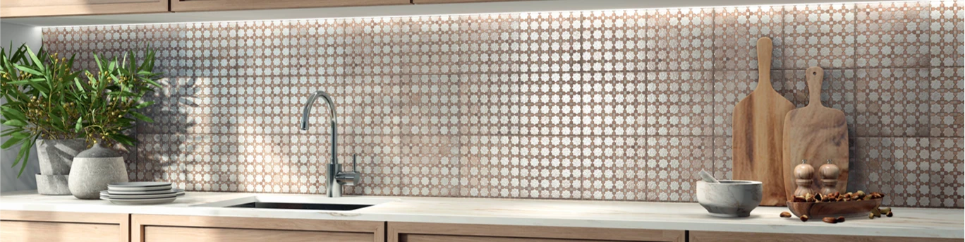
Pattern. Arabian ft. Riad is a Spanish-made decorator with intricate Moroccan-inspired patterning. Pick a grout that matches the lightest tone in the pattern, so each tile joins the next and the pattern flows across the wall or floor as one design rather than a set of squares.


Room by room
Bathroom floors
The bathroom floor is one of the highest-stakes grout calls in any renovation. You see it every day, it gets wet constantly and, although it can be changed, it's not ideal.
Our advice: go one to two shades darker than the tile. It hides the natural darkening that happens in wet areas and gives the floor a grounded, finished feel.
If you're heating the floor, ask in-store about a flexible grout made for heated floors, so the joints move with the temperature. (Fair warning: if you have a dog, the warm floor will become their favourite spot in the house.)
Bathroom walls
Wall grout can sit a touch lighter than floor grout. Walls don't collect the same marks, and a lighter grout helps a bathroom feel brighter when natural light is limited.
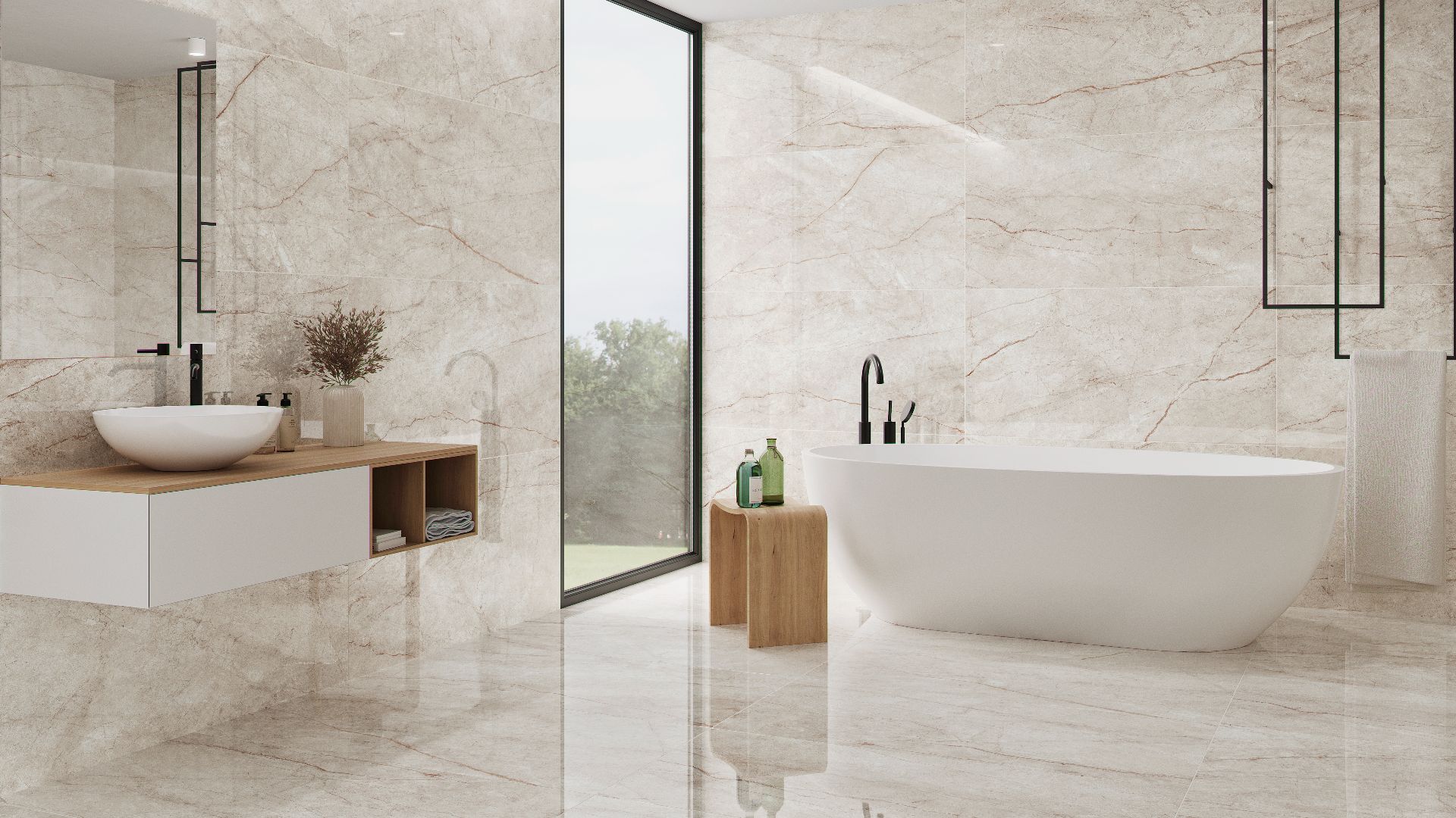
For a marble-look wall in Lumiere, inspired by Calacatta Oro marble with soft golden veining, choose a warm white grout rather than a cool one so it sits with the warmth of the veining.
Kitchen splashbacks
The splashback is where contrasting grout is used most, and where it's most justified. It's a framed surface, so a graphic grout reads as a design layer rather than a distraction.
A patterned decorator like Arabian ft. Riad suits a tonal grout so the pattern carries. A large format marble-look splashback in Lumiere or Rainforest White suits a near-invisible tonal grout, so the surface reads as one piece of stone. See our kitchen splashback guide for more.
Large format floors and living areas
Large format tiles have so few grout lines that each one carries more weight.
The rule is simple: always tonal, always within two shades of the tile, and always a fine grout that fills cleanly. Porcelain with a near-matching grout gives the effect of a stone floor rather than a tiled one, which is exactly why large format tiles are worth it. It's also the look that carries best when your living floor flows out to the terrace for summer.
The practical checklist before you buy grout
- View samples together in your actual space. Take a tile sample and two or three grout options home. Look at them morning and evening. Grout reads very differently under artificial and natural light.
- Be honest about maintenance. If you're tempted by white grout on a shower floor, ask yourself how often you'll clean it. A soft grey or sand grout needs far less upkeep and ages better.
- Match the grout type to the job. Joint width, finish, heated floors and wet areas all change which grout you need. Our in-store team can advise on the right product for your tile.
- Don't decide under showroom lighting. Showroom lighting is designed to make tiles look their best. Your home won't light them the same way.
- Use a designer or our in-store experts for advice. That's what they are there for. And don't blindly assume your tiler will know how to make the best design and colour choice.
The tiles we love, and the grout we'd pair them with
- Rainforest White: Soft white or pale grey, tonal. Lets the silver veining carry. View range →
- Lumiere ft. White and Lumiere ft. Natural: Warm white to soft beige, tonal. Keeps the golden veining warm. View range →
- Arabian ft. Riad: Matched to the lightest tone in the pattern, so the design flows tile to tile. View range →
- Taipei Green: Soft mid-grey or warm stone. Lets the tonal variation sing without a stark white grid. View →
Browse the full trade products range for grout, or visit one of our 35+ stores nationwide. Not sure yet? Try 5 Samples for $15, delivered anywhere in NZ, and refunded when you place your full order.
Frequently asked questions
What is the best grout colour for white tiles?
A white or very pale grey grout. If the tile is a warm white, avoid a bright cool white grout and choose one with a similar warm undertone.
Should grout be lighter or darker than tile?
For most floors, slightly darker is the safer and more forgiving choice: it ages better and hides marks. Stay in the same colour family.
What colour grout goes with green tiles?
A soft mid-grey or warm stone grout lets the colour variation in a green tile read naturally. Bright white grout tends to fight the green and break the surface into a grid.
Does grout colour affect how big a room looks?
Yes. Tonal grout makes a room feel larger and calmer. High-contrast grout makes the surface more graphic and can make a small room feel busier.
Can I change my grout colour later?
Yes, with a grout colourant or by removing and replacing the grout, but it's slow work. Getting it right at installation is always easier.




 Save and collect tiles
